introduction
- Packages I will use to read in and plot the data
- Read in the data from part 1
Interactive graph
- Start with the data prepared in the previous part
- Group the datasets by the associated region
- Round percentages to 2 decimal places for easier viewing
- Create the chart object with the x-axis tied to the year column
- Bind the minimum and maximum year values to the years of the dataset, bound to
dataMinanddataMax; name axis; relocate name so it does not overlap with subtitle - Raise the minimum shown value of the y-axis to make the changes over time easier to visualize (otherwise the graph is too clustered to see well); name axis; position name in middle of graph
- Create the lines based on the Employment column and remove the legend
- Create the interactive hover-over data element.
- Add title and subtitle, link to source data
RInd %>%
  group_by(Region) %>%
  mutate(Employment = round(Employment, 2)) %>%
  e_charts(x = Year) %>%
  e_x_axis(min = "dataMin", max = "dataMax", name = "Year", nameLocation = "middle") %>%
  e_y_axis(min = 15, name = "% of workforce in Industry", nameLocation = "middle") %>%
  e_line(serie = Employment, legend=FALSE) %>%
  e_tooltip(trigger = "axis") %>%
  e_title(text = "Percentage of workforce in Industry, by world region",
          subtext = "Between 1991 and 2017, source: Our world in Data",
          sublink = "https://ourworldindata.org/grapher/industry-share-of-total-emplyoment?tab=chart")
Static Graph
- Call the ggplot function, indicating the dataset we want to use, the columns to use for the axes, and the column used to segment the data into different lines.
- Use geom_line to indicate we want the data formatted as a line plot
- Use
lwdto make the lines larger so they are more visible - Relabel y axis to indicate unit involved
- Use minimal theme to lower the amount of clutter
ggplot(RInd, aes(x = Year, y = Employment, color = Region)) +
  geom_line(lwd = 2) +
  labs(y = "Workforce employed in industry as %") +
  theme_minimal()
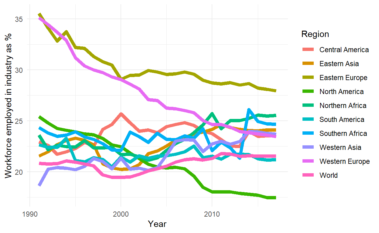
These graphs shows a comparatively steady ~+-5% employment in the world, but relatively drastic decreases in first world regions, particularly western Europe, with a general climb elsewhere